«А» is for «Автопортрет» (Self-portrait)
«А» is the 1st letter of the Russian alphabet. In the Early Cyrillic alphabet this letter used to meana «I». This section gives us an opportunity to look at the author himself. Interestingly, «I» sounds like «eye» and it is eyes of the portrayed that invite us into the painting. For some self-portraits work as manifestations of their professions, for others they are means of self-analysis and utmost sincerity.
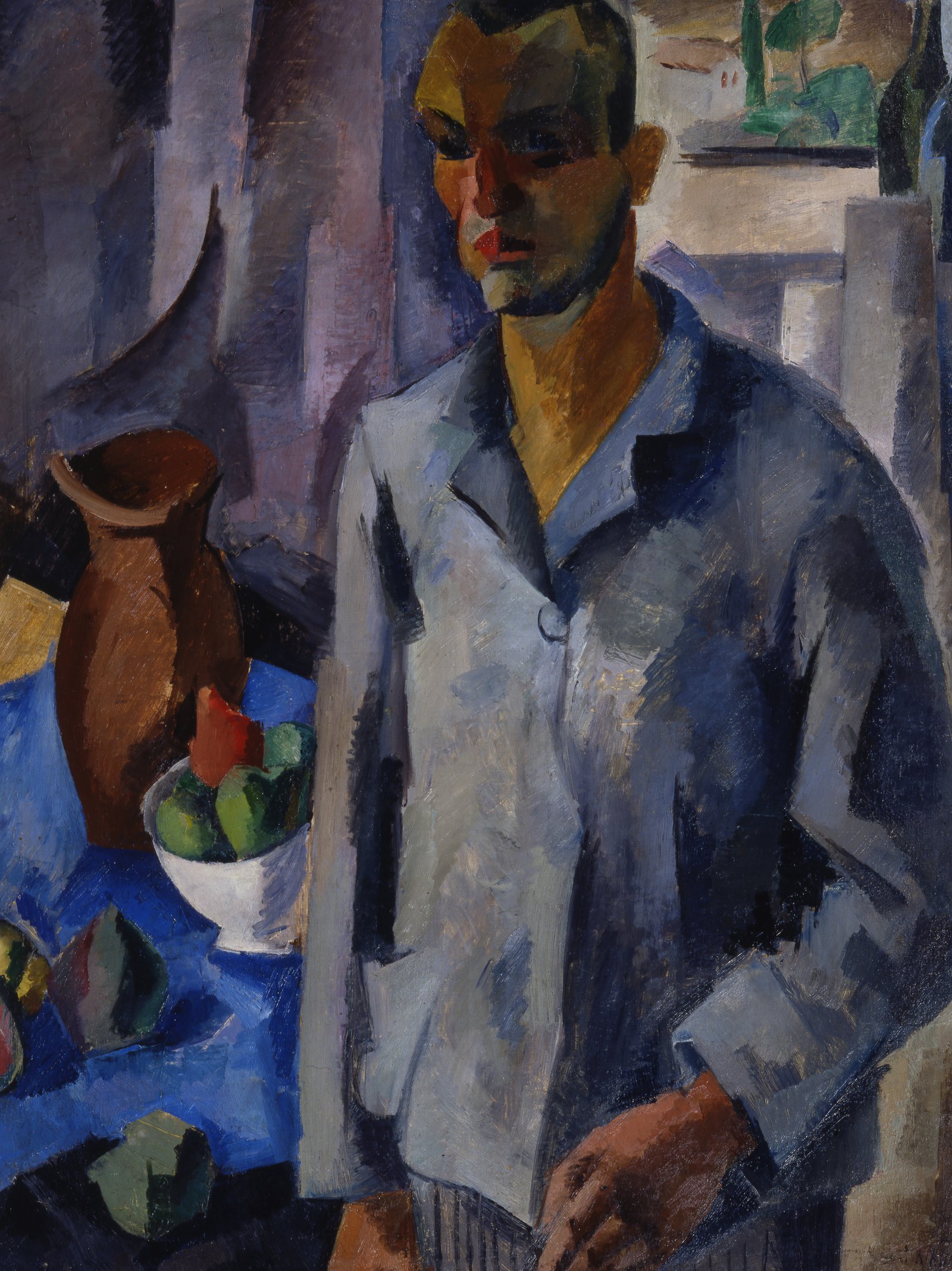 ROBERT FALK (1886-1958). Self-portrait. 1916. Oil оn canvas. Saratov State Art Museum named after A.N. Radishchev.
«Б» is for «Беспредметность» (Non-objectiveness)
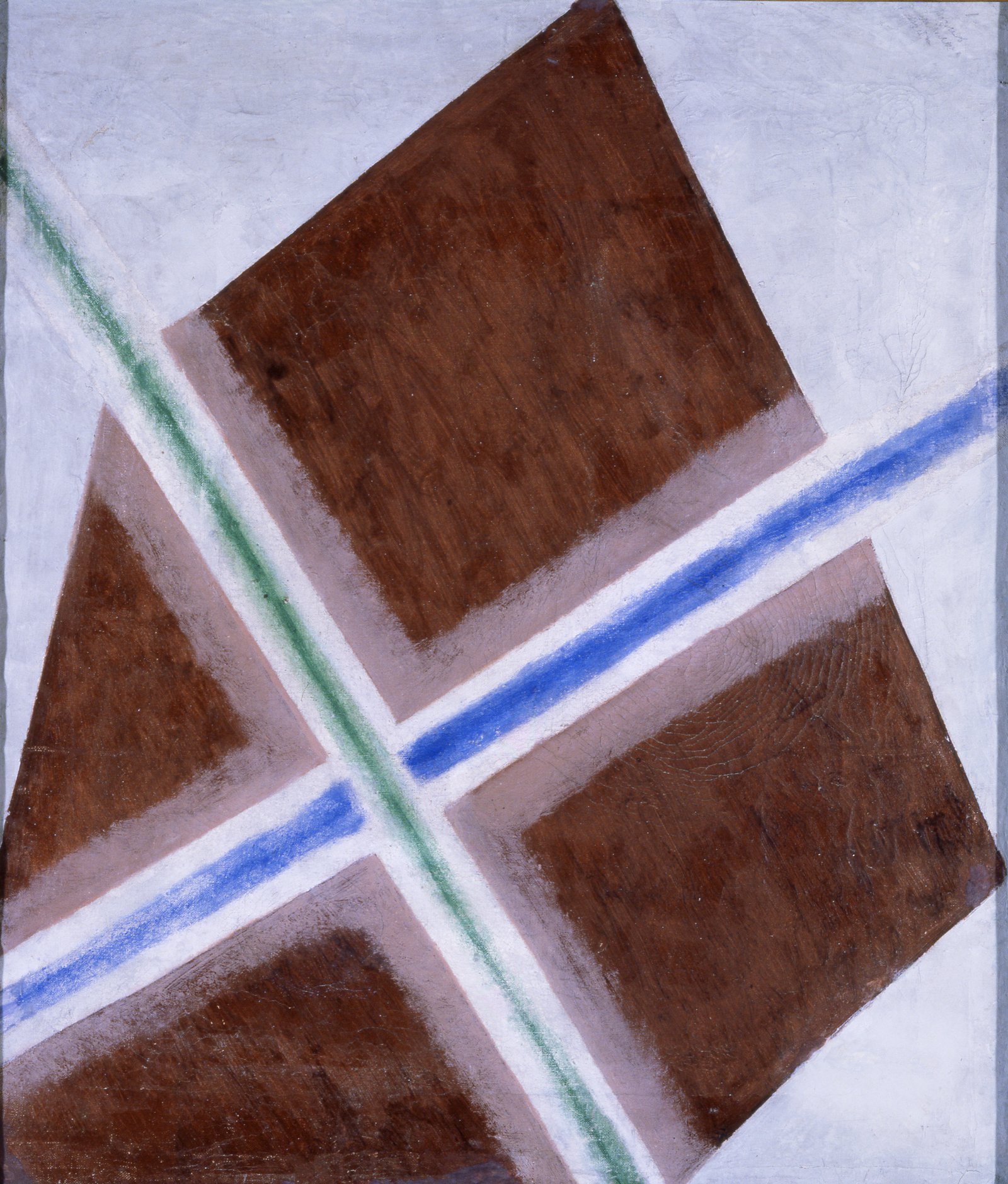
«Б» is the 2nd letter of the Russian alphabet. In the Early Cyrillic alphabet this letter used to mean «letter». Out of the context of a word, a letter becomes a sign devoid of narrative but it retains its sound and outline. Non-objective art also explored the field of primordial. Malevich saw in non-objective art the «point zero of forms» and «new pictorial realism» that he sought. Rodchenko and Stepanova, the ideological opponents of the Suprematists, saw the struggle with «materialism of the object» as the main thing. Despite the theoretical divergences and disputes, the aspiration for non-objectivity embraced almost all Russian art of the early 20th century.
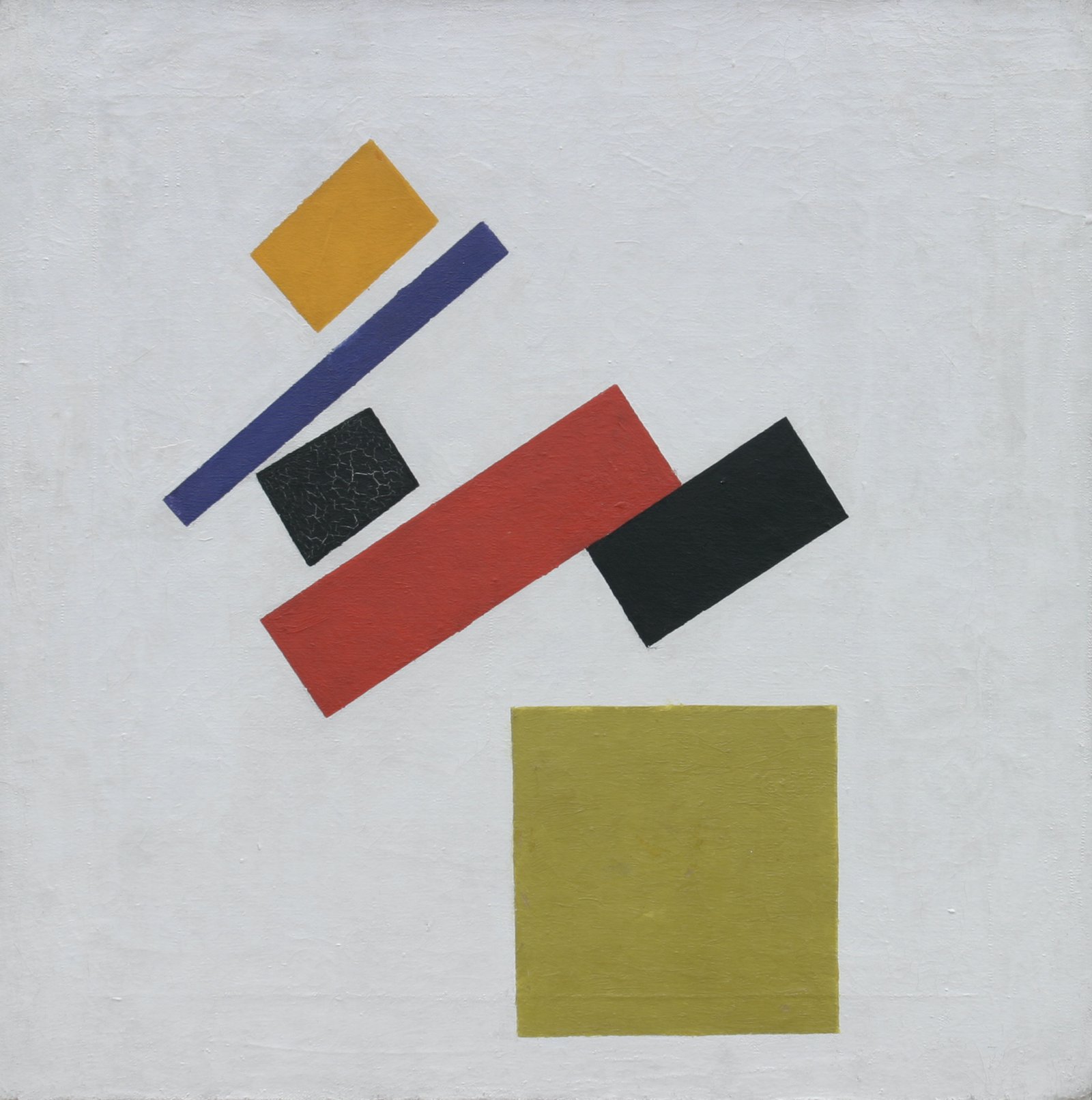 KAZIMIR MALEVICH (1879-1935). Suprematism. 1915. Oil on canvas. lvanovo Regional Art Museum.
«В» is for «Воздух» (Air). «В» is the 3d letter of the Russian alphabet.
In contrast to non-objective paintings, which deny volume and depth and fix the airless environment of pure experiment, for landscape artists air becomes one of the main objects of representation. Its role is particularly evident in the case of Russian nature, devoid of external effects, living its quiet inner life. In the paintings by Polenov and Levitan the streams of air are almost tangible and the invisible appears to be more material than the visible.
«Г» is for «Глубина» (Depth)
«Г» is the 4th letter of the Russian alphabet. Depth, the third dimension in a painting, is closely related to the aerial environment and almost entirely absent in non-objective painting. The possibility of seeing a volumetric and dense image instead of a graphic plane was a sort of revolution in art. Falk employs 'shape-shifts', thus achieving greater emotional expressiveness, Kuindzhi and Volkov 'draw' attention into the very depth of the image with the help of light and colour stains, while Shishkin immerses the background in total darkness that engulfs the viewer like a black hole.
«Д» is for «Детектив» (Detective). «Д» is the 5th letter of the Russian alphabet.
Art history often takes on the detective genre. By removing layers of old varnish, restorers find images that have long been hidden from view, they can change the dating or question the authorship of the work. Museum expertise allows to distinguish authentic works from fakes, solve the problem of the attribution of disputed works and the identification of portrait subjects, and sometimes even reconstruct missing parts of the painting.
«Е» is for «Естество» (Natural Beauty)
«Е» is the 6th letter of the Russian alphabet. Artists have always sought to capture the nude, a symbol of being. Over the centuries, the naked body and the way it is represented in art changed depending on the trends of the time. In the 20th century, authors sought to capture the peculiarities of national beauty, as Kustodiev did in «Russian Venus». Larionov created a whole series of «Venuses» reflecting on the way Western European art works with models. His «Village Bathers» are inspired by Gauguin’s paintings.
«Ё» is for «Всёчество» (Everythingness). «Ё» is the 7th letter of the Russian alphabet.
«Ё» is a letter that gained official recognition in 1783. The first word printed with it was «Всё» («Everything»). That word gave its name to the concept of Everythingness proposed by Zdanevich. It implied that the artist «comprehends the totality of the means, uses all the means of mastery to achieve the goal, synthesizing them, creating and approaching the perfect art». Zdanevich believed that other movements have exhausted themselves and they should be replaced by Everythingness.
«Ж» is for «Жанр» (Genre). «Ж» is the 8th letter of the Russian alphabet.
Genre painting depicts daily life in its fullness and entirety, in its true colours — scenes of everyday life with the participation of people from the people: merchants, peasants or bourgeoisie. Like the director of a theatre production or a film, the artist chooses the plot, arranges the scenery, saturates the scene with details and characters, which play out the story in his interpretation. Two paintings with a similar subject «New Owners» and «On the Terrace» show how differently the story unfolds depending on the temperament and interests of the artist: Bogdanov-Belsky hides secret meanings in his work that don’t immediately meet the eye of the viewer, while Kustodiev admires the calm of family life and makes up the plot from colour spots, imaginary smells and sounds.
«З» is for «Зеркало» (Mirror). «З» is the 9th letter of the Russian alphabet.
In the 20th century against the background of a radical reform of artistic language came the time of «broken mirror» which refracted space in multiple and diverse ways. Using the principle of kaleidoscopic vision, artists «disassembled» reality into fragments and recreated it according to the laws of the new — artistic — reality. The keen dynamics of the painting’s space, the sharpness of perception of what is happening even in the most static scenes, was an embodiment of going beyond the traditional understanding of the nature of art.
 ARISTARKH LENTULOV (1882-1943). Portrait of М.Р. Lentulova (1912). Oil оn canvas. Primorye State Art Gallery.
«И» is for «Импровизация» (Improvisation). «И» is the 10th letter of the Russian alphabet.
Improvisation in various kinds of art, like dance, poetry, music, visually reflects the artistic quest of the early 20th century: to break with the unspoken truths, restart one’s own creative process, expand the boundaries of perception. The idea of a synthesis of the arts — the unity of colour, sound, smell and movement — dominated the artistic milieu. The idea of synthesis was most fully embodied in the work and theoretical legacy of Kandinsky, the author of «colourised music», who believed that sound, paint and word were synonymous phenomena.
«Й» is for «МузеЙ» (Museum). «Й» is the 11th letter of the Russian alphabet.
The word museum comes from the Greek mouseĩon. In Antiquity, however, it meant «a place dedicated to the muses». The first mouseions were sacral porticoes situated in woods, foothills and springs. Gradually the «gifts to the gods» accumulated in them started to be put on display. Thus the first exhibitions were born.
«К» is for «Кракелюр» (Craquelure). «К» is the 12th letter of the Russian alphabet.
«K» goes back to the Phoenician letter «kaph» and means «palm». A painting or a ceramic piece acquires over time a unique pattern that allows us to read it like a palm. Craquelure is caused by cracks, small cracks in the paint or varnish of a painting. The pattern and nature of craquelures reveals much to researchers about the age, conditions of creation and even usage of the work. Just as palm lines or facial wrinkles tell about the lifestyle and character of a person.
«Л» is for «Личность» (Personality). «Л» is the 13th letter of the Russian alphabet.
Portrait is an act of unity of two persons: the one who paints and the one who is portrayed. In Russia the formation of this genre took place through exposure to European artistic experience, which for a long time served as an example of good taste. It was not uncommon for painters to paint the lace collar, for instance, as meticulously as they did the face relying on the social status of the model. Composition, surroundings, pose, harmony or contrast served as a clue to the character of the model.
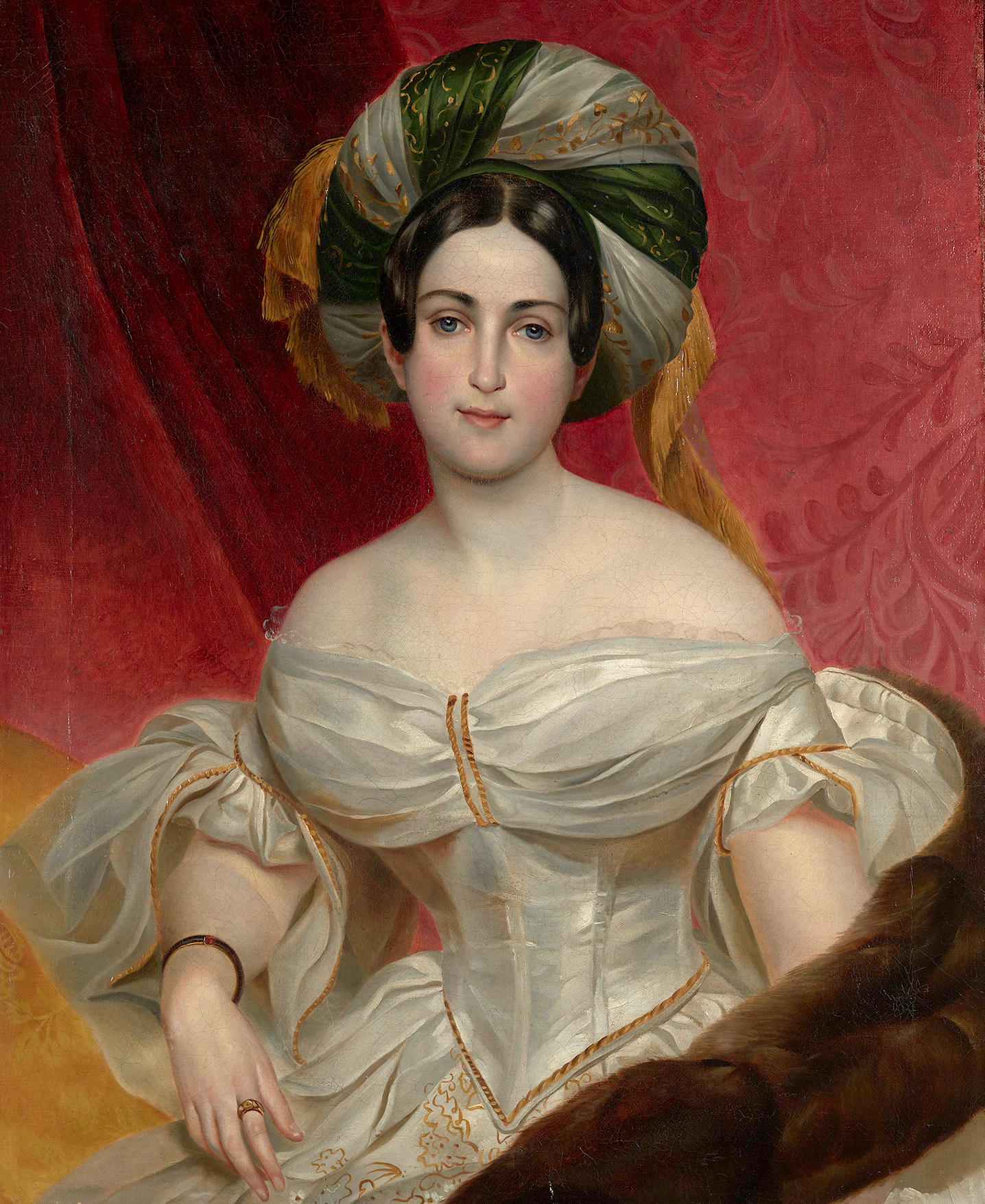 KARL BRYULLOV (1799-1852). Portrait of Aurora K. Demidova (1836-1838). Oil оn canvas. Nizhny Tagil Museum-Reserve «Mining and Works Ural».
«М» is for «Марина» (Marina). «М» is the 14th letter of the Russian alphabet.
«M» comes from the Greek letter «μ», which in turn comes from the Phoenician letter «mem» and the Egyptian hieroglyph meaning «water». In Russian art the sea became the main creative line for the marine painter Aivazovsky, who created hundreds of different variations of this image. It is no coincidence that Aivazovsky is considered the greatest master of seascape in Russia. The artist was born in Feodosia, by the Black Sea, and throughout his life he returned to this small seaside town which was his main source of inspiration.
«Н» is for «Неофициальное искусство» (Unofficial art). «Н» is the 15th letter of the Russian alphabet.
Soviet unofficial art opposed the socialist realist tradition and actively assimilated the legacy of the historical avant-garde and experimented with new forms. The Pablo Picasso exhibition (1956) and the American National Exhibition (1959) in Moscow, which introduced a whole generation of artists to the examples of Western European art of the twentieth century, became a starting point for unofficial art. For the most part, the pioneering works that have become classics of the post-war avant-garde were created underground.
«О» is for «Орнамент» (Ornament). «О» is the 16th letter of the Russian alphabet.
The ornament came to painting from the arts and crafts. Initially it was a part of decoration, but it was discovered in the art nouveau style as an independent artistic device. The ornament forms the texture and rhythm, creates its own drama, supporting or contrasting with the form. The passion for ornament became the precursor of avant-garde experiments. Artists abandoned the depth, focusing on the plane, building new connections between objects, crushing the image into fragments and creating it anew. The boundary between reality and ornament disappeared, the entire world was transformed into a continuous ornamental canvas.
«П» is for «Прорыв» (Breakthrough). «П» is the 17th letter of the Russian alphabet.
Avant-garde art can be perceived as a series of breakthroughs in artistic language. The very idea of the fusion of art and life, the mere notion of art having a transformative power, the return to folk art and primitive forms of art were a breakthrough. And it was crucial that several artists at once found the way to the non-objective form, which was connected to the most radical transformations in the language of art. Particularly interesting in this regard are the experiences of Popova, an artist who has found her way «beyond the canvas» and to break with materiality.
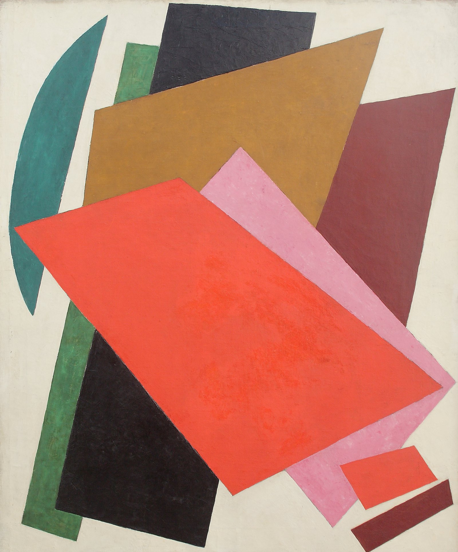 LIUBOV POPOVA (1889-1924). Painterly Architectonic (1917). Oil оn canvas. Kovalenko Art Museum, Krasnodar.
«Р» is for «Русь» (Rus). «Р» is the 18th letter of the Russian alphabet
At the beginning of the 20th century, many representatives of the newest artistic movements rediscovered Russian folk culture. «I understood the peasants through the icon,» Malevich admitted in his memoirs. «The Mower» was one of the main characters in his peasant cycle, in which the artist combined cubist elements with sacred ones. The painting «Women with Rakes» by Goncharova can also be called a synthetic work. On the one hand, the artist refers to the lubok tradition of street signage and on the other hand, uses Western European art movements as references, such as French Fauvism and German Expressionism. Kustodiev followed a different path. He depicted noisy festivities of the merchant Russia and its everyday customs relying on the examples of folk art.
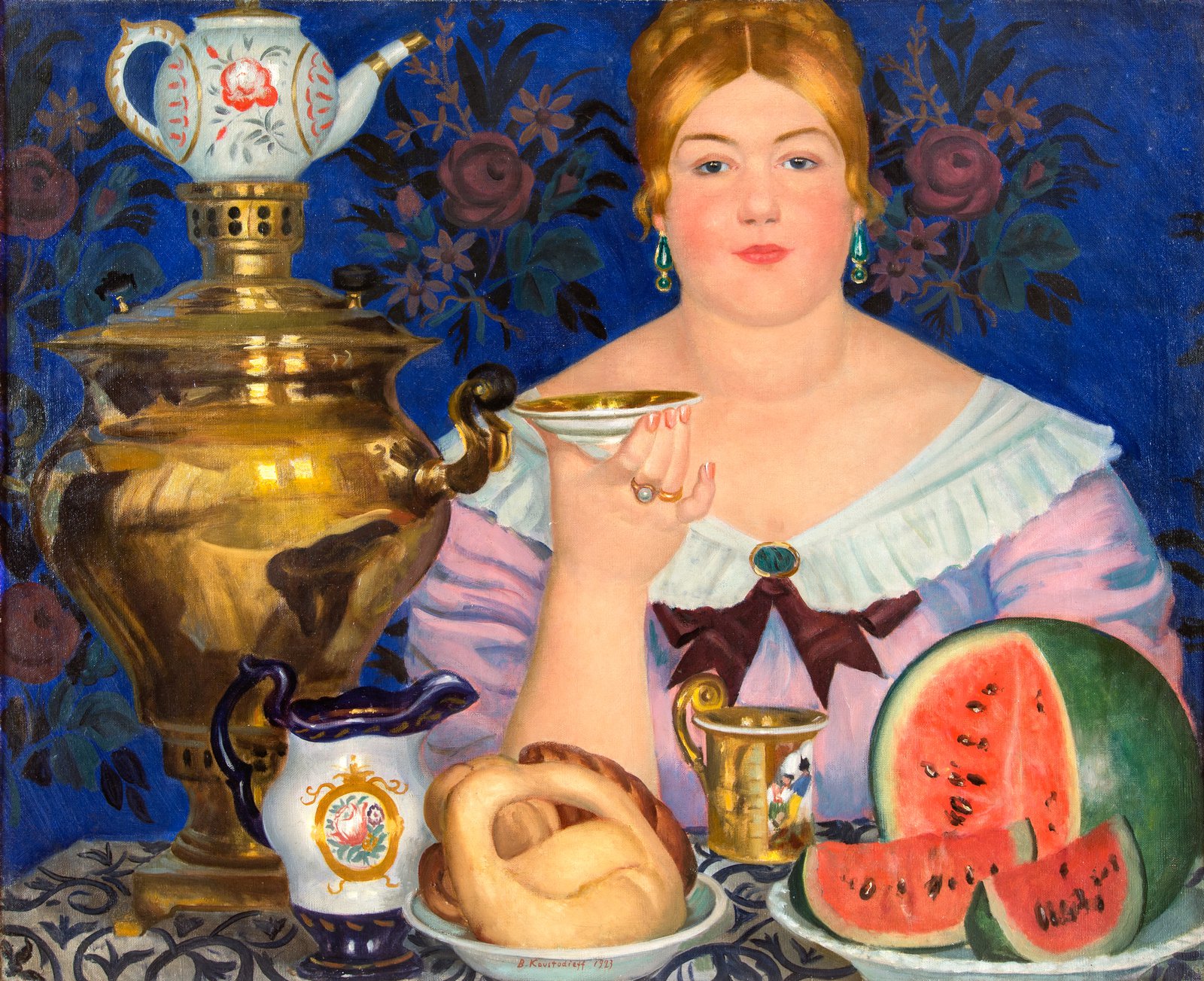 BORIS KUSTODIEV (1878-1927). Merchant’s Wife at Теа (1923). Oil оn canvas. Nizhny Novgorod State Art Museum.
«С» is for «Серебряный век» (Silver Age). «С» is the 19th letter of the Russian alphabet.
Chronologically, the «Silver Age» refers to the turn of the nineteenth to the twentieth century, stylistically, it refers to those representatives of the artistic process whose work is imbued with symbolism, longing for the world culture and the gallant beauty of words, movement, drawing. In contrast to the social acuteness and realism of the of the Itinerants, the artists of the «World of Art» and the «Blue Rose» decided to improve an unflattering Russian reality not by denouncing vices and heroism, but with refinement and refined beauty. The members of the «World of Art» sought inspiration in the style of Louis XIV, the reign of Elizabeth, empress of Russia, and the aesthetics of the Italian Commedia del Arte. The artists of the «Blue Rose» strove to convey the 'beyond': their paintings are symbolic, musical and weightless.
«Т» is for «Товарищество» (Union). «Т» is the 20th letter of the Russian alphabet.
The Itinerants were Russia’s first free artistic union. In 1862, 14 graduates of the Saint Petersburg Academy of Arts refused to undertake competitive work on a mythological theme. The artists insisted that the surrounding reality and modernity were the priority in their reflection and depiction. As a result, the rebels were deprived of academic privileges, but they remained true to their principles and went down in the history of Russian painting as the founders of critical realism, psychological portraiture and Russian landscape. Levitan participated for the first time in the Itinerants exhibition in 1891. His «mood landscapes» — characteristic of quiet Russian nature — are meditative and lyrical, filled with a deep experience of nature.
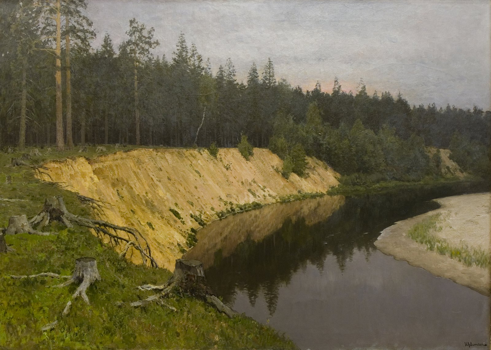 ISAAC LEVITAN (1860-1900). Forested Riverside. Nightfall (1892). Oil оn canvas. Tver Regional Art Gallery.
«У» is for «Условность» (Conventionalism). «У» is the 21st letter of the Russian alphabet.
Conventionalism is a conscious abstraction, a tool for comprehending reality through its simplification, generalization and revealing of the most characteristic features. Conventionalism in art has existed since its earliest manifestations in primitive ornaments and signs, it has retained its fundamental significance in folk art and church painting and received new development in the art of modernism. Everything that aspires to a circle becomes a circle, everything that aspires to straightness becomes a line and everything that aspires to stability and symmetry becomes a square. Thus the ancient conventionality was the basis of the research of new forms.
«Ф» is for «Фактура» (Texture). «Ф» is the 22nd letter of the Russian alphabet.
The texture of the painting surface keeps traces of artist’s hands and tools and can tell a lot about one’s working methods, time and style. Striving for the illusion of authenticity, classical painters used glazing — they applied many thin layers of paint, literally showing the volume and creating a special effect of colours shimmering on the surface of canvas. Smooth surface is not uncommon for the avant-garde artists, a reminder that the texture is also an individual handwriting of an artist and a reflection of his temperament. In the second half of the 19th century, impulsive painting appeared in Russian art, and in the early 20th century, the texture became an experimental space for innovative artists.
«Х» is for «Хранитель» (Keeper). «Х» is the 23d letter of the Russian alphabet.
Museums have always preserved and studied artefacts to ensure the continuity of culture. In the 20th century, this function proved particularly important. Numerous historical cataclysms — wars and revolutions — threatened the existence of entire art movements. Museum curators saved canvases doomed to destruction by hiding them in store-rooms, where they could lie unidentified in rolls for decades.
«Ц» is for «Цветопись» (Colour Painting). «Ц» is the 24th letter of the Russian alphabet.
The term «colour painting» was invented by Olga Rozanova, one of the Amazons of the Russian avant-garde, for whom this discovery was the culmination of her creative path. The artist came to colour painting through her explorations of non-objective art and investigations of the role of pure colour in painting, its ability to shrink and disperse. The system she created is in many ways in opposition to Suprematism: while Malevich’s colour only divides planes, Rozanova’s colour is valuable in and of itself. Purified from the «three surrogates of painting» — «texture,» «sculptural form of things» and «airy atmosphere,» it becomes the quintessence of everything, reaches the absolute limit of its piercing.
 OLGA ROZANOVA (1886-1918). Diffusion of Colour (1917). Oil оn canvas. State Museum Association «Artistic Culture of the Russian North».
«Ч» is for «Чёрный» (Black). «Ч» is the 25th letter of the Russian alphabet.
Black, like white and grey, is an achromatic colour. The word achromatic itself means «colourless»: it is not colours in the usual sense, but tones that are used to enrich the hues. Pure black and white do not exist in nature. Pupils of art schools are not allowed to use black paint at all. They are taught to achieve the «black effect» by mixing various chromatic colours. Black is a paradox: it absorbs all existing colours, it needs light more than any other colour, being «colourless» in its essence. It is not surprising that black took a special place in the palette of innovators — Suprematist Malevich («Black Square») or nonconformist Grositsky («Apple»), who used it to emphasise the shape of an object.
«Щ» is for «Щедрость» (Generosity). «Щ» is the 27th letter of the Russian alphabet.
Traditions of philanthropy in Russia date back to the 17th century. One of the leading patrons of the arts at the turn of the 19th and 20th centuries was Savva Mamontov, a great industrialist and builder of railways. He sponsored the magazine «Mir Iskusstva» («World of Art») and the Moscow Private Russian Opera discovering Fyodor Chaliapin. In 1870, Savva together with his wife bought Abramtsevo, the former estate of writer Sergei Aksakov near Moscow. Under the Mamontovs a real artistic colony started here. The estate played host to Repin and Surikov, Nesterov and the Vasnetsov brothers, Serov and Korovin, Polenov and Vrubel…
«Ъ» is for «ОбЪект» (Object). «Ъ» is the 30th letter of the Russian alphabet.
«Object» is a polysemic term. In everyday life, an object is more often understood as a material object, a thing. Still-life depicting «immobile things in realistic space» gives the painter more freedom in the arrangement of the elements but the randomness of their selection is deceptive. The painter painstakingly arranges the composition relying upon an interesting pictorial or symbolic juxtaposition of objects. Viewing still-lifes we can easily identify the depicted objects but we are not satisfied with the process of «recognition», which is only a small part of an aesthetic experience. This experience can be enriched by shifting attention from the whole to an individual object. The independent object loses its connection with the pictorial plane expanding the boundaries of the painting and making the previously hidden meanings tangible.
«Ы» is for «измЫ» (-isms). «Ы» is the 29th letter of the Russian alphabet.
All sorts of -isms emerged in the early 20th century as a response to the challenges of time requiring artists to adopt new methods and approaches to art. One of the most important trends of this period was Cezannism. The adoption of the painterly style of Paul Cézanne by Moscow artists gave way to a variety of new artistic forms. Vivid colours, an inner tension between things, the particular stillness of the image — all this reflected with the spirit of the times and the thirst for change but it was often criticised by the older generation of artists.